Rising from the Dead
Tracking California's COVID-19 death data daily — watching numbers disappear, reappear, and rewrite history — and what it reveals about the state of modern data.
“Statisticians have always worked for better DQ. That is why we worry about outliers and long-range dependence and exploratory methods. It is why we study robust statistics, and stress the need to understand the science and to talk to domain experts before undertaking an analysis.” Data quality: A statistical perspective. Technical report from NISS Karr, Sanil, and Banks, 2005
It’s Tuesday morning, May 10th, 2022. You’re staring incredulously at California’s COVID-19 death counts, graciously made available to the public via the COVID-19 Data Repository by the Center for Systems Science and Engineering (CSSE) at Johns Hopkins University on Github (Dong E, Du H, Gardner L, 2023). You’ve been tracking the numbers daily (Figure 1, Table 1).1 It’s higher than anyone would have ever predicted two years ago. But that’s not why you don’t believe it. You don’t believe it because it ought to be higher. Over the past week the number has barely budged: + 29, + 0, + 26, +0, +0, +6. Last Tuesday it was +102. From your analysis, you were expecting that Friday would suffer about 120-150 or so deaths.2 Only 26 were reported. You could accept that number, and in doing so accept that we had suddenly and swiftly hit a turning point in the pandemic. But you won’t. After two years working with pandemic data, you know better.
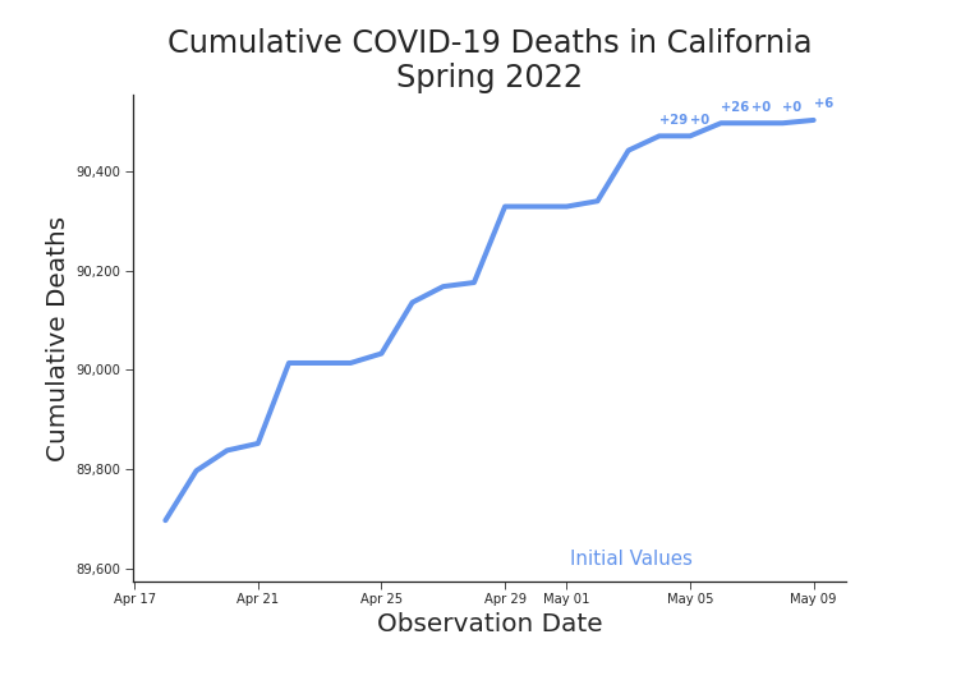
Figure 1. Cumulative Deaths in California, Spring 2022 After weeks of climbing briskly upwards, deaths have suddenly slowed. Perhaps we have finally flattened the curve. For a detailed view, see Table 1.
Rising from the Dead
Table 1. Detail of Cumulative Deaths in California, Spring 2022 Highlighted in blue, we easily see the pattern of Tuesday and Friday surges. We’ve highlighted in red the suspicious deviation from the pattern. Note, these are initial values.
| Date | Weekday | Cumulative Deaths | Daily Deaths |
|---|---|---|---|
| 2022-04-19 | Tu | 89797.0 | 100.0 |
| 2022-04-20 | W | 89838.0 | 41.0 |
| 2022-04-21 | Th | 89852.0 | 14.0 |
| 2022-04-22 | F | 90014.0 | 162.0 |
| 2022-04-23 | Sa | 90014.0 | 0.0 |
| 2022-04-24 | Su | 90014.0 | 0.0 |
| 2022-04-25 | M | 90033.0 | 19.0 |
| 2022-04-26 | Tu | 90136.0 | 103.0 |
| 2022-04-27 | W | 90168.0 | 32.0 |
| 2022-04-28 | Th | 90176.0 | 8.0 |
| 2022-04-29 | F | 90329.0 | 153.0 |
| 2022-04-30 | Sa | 90329.0 | 0.0 |
| 2022-05-01 | Su | 90329.0 | 0.0 |
| 2022-05-02 | M | 90340.0 | 11.0 |
| 2022-05-03 | Tu | 90442.0 | 102.0 |
| 2022-05-04 | W | 90471.0 | 29.0 |
| 2022-05-05 | Th | 90471.0 | 0.0 |
| 2022-05-06 | F | 90497.0 | 26.0 ⚠ |
| 2022-05-07 | Sa | 90497.0 | 0.0 |
| 2022-05-08 | Su | 90497.0 | 0.0 |
| 2022-05-09 | M | 90503.0 | 6.0 |
(Bold marks the Tuesday/Friday surge pattern — blue in the original; ⚠ italic marks the suspicious deviation — red in the original.)
Last May you began to sense that there was something amiss. It was as if the data was playing tricks on you. You’d check the tally for one day and swear it had changed the next time you looked. You had tinkered with a few models that performed well enough, but as soon as you pulled the newest dates, those models fell apart. They even failed on the training dates. With no one to blame but yourself, naturally you blamed the data. Eventually, you went analogue. You began writing down the total everyday. It was barely a month before your paranoia paid off. On June 10th, 2021, three hundred and thirty-nine people rose from the dead. By June 9th, 2021, California had suffered 63,615 deaths. By the 10th they had only suffered 63,216 (Figure 2). Negative 399 deaths were reported on the 10th. About 1 out of every 200 dead in the Golden State were no longer dead.3
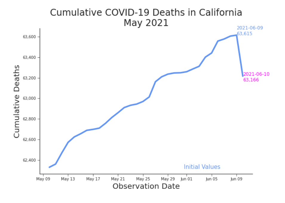
Figure 2. Cumulative Deaths in California, May-June 2021 Vindication. According to the daily tally, three hundred and thirty-nine fewer people were dead on June 10th than on June 9th. You had your proof. You weren’t imagining things. You were being gaslit. And the data was doing it. But in less than 24 hours, your victory was overwritten. “June 11, 2021 — California, US — Back correction of Alameda, California’s deaths due to adjustment of death counts to agree with the state definition” appeared at the end of the expansive bullet points under “Data modification records” in the README.md file in the JHU GitHub repository (COVID-19 Data Repository by the Center for Systems Science and Engineering (CSSE) at Johns Hopkins University, 2021). Where once there had been a miracle writ in data, there was now nothing extraordinary at all (Figure 3).
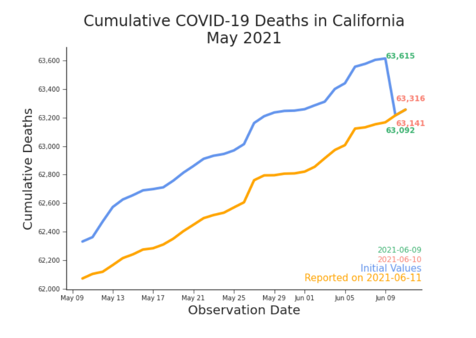
Figure 3. Restatement of Cumulative Deaths in California, June 2021 The miracle on display in Figure 2 disappears when data is pulled at a later date. Without the wonders of version control, this miracle would have been lost forever. Since then, you’ve recorded other days where cumulative counts suddenly decreased. Some disappearing, some persisting. The data often changes and those changes often rewrite history. But they do not rewrite reality. The tragedies occurred when they did. Whether or not we ever represent them accurately in data will not change that. But data, even when under frequent revision and riddled with imperfections, is the basis upon which many decision makers and everyday people try to prevent future tragedies. The grounds for their choices–the data available at the time of the decision–is often forgotten.
Table 2. Detail of Cumulative Deaths in California, October 2021 Initial values are highlighted in yellow and the first released values are highlighted in green. The initial and first released values for October 18th, 2021 do not agree. They are instead highlighted in red.
| Observation : Release | 10-16 | 10-17 | 10-18 | 10-19 | 10-20 |
|---|---|---|---|---|---|
| 2021-10-16 | 70604 | 70604 | 70604 | 70216 | 70216 |
| 2021-10-17 | 70616 | 70616 | 70409 | 70409 | |
| 2021-10-18 | 70829 ⚠ | 70468 ⚠ | 70468 | ||
| 2021-10-19 | 70874 | 70874 | |||
| 2021-10-20 | 71032 |
(Italic = initial value — yellow in the original; bold = first released value — green; ⚠ marks October 18th, where the two disagree — red.)
False Alarms
In October, 2021, the deaths weren’t only disappearing–they were moving. By then you’d started tracking two separate counts. The first count was the first number you saw reported for a date. These were the initial values. Often, a day’s death toll was reported before the day was even done. You knew that number could change. You knew you needed a better one. The dataset itself was constantly being updated throughout each day, creating many versions of the same dataset that differed only slightly from the previous one. Instead of pulling every new version of data, you only pulled it once at the end of each day. This was the finalized version of the data, or release, for each date. Each release contained values for the observations, the dates being reported in Table 0.2. You didn’t trust an initial value that appeared in a release with the same date as the observation being reported. Instead, you prefered the first released value. That was the first value reported for an observation for a date subsequent to its observation date. For example, you waited for October 19th’s release to use the value reported for October 18th. In October of 2021, it didn’t matter which value you looked at: both were suspicious (Figure 4). Initial values showed a massive spike in deaths on October 28th–about twice the size as any recent or subsequent date. In theory, the first released values should have looked more reasonable than those initial values. But they were worse. The 2X surge in deaths remained, only now it occurred on October 19th. Negative 148 deaths now occurred on the 18th. You didn’t know if there actually was a surge in deaths at all. If so, was it really all on one day? Perhaps the deaths were spread across days and incorrectly attributed to a single day. Whichever way you looked at it, none of the data looked right.4
Dangerous Days
Back to where we began, in May 2022, you had already been getting frustrated with California’s bi-weekly reporting cadence (Figure 5). According to an update in the README.md, California is only updating on Fridays and Tuesdays. But that shouldn’t mean that all the deaths occur on Fridays and Tuesdays. You had expected that the data would be updated on those days, but the deaths attributed to the days on which they occurred. Regardless of what it should be, the data says almost all deaths now occur on Tuesdays and Fridays. This is why you were expecting about 120 more deaths last Friday. But this week there was no Friday surge.
A bullet point in the Dong E, Du H, Gardner L (2023) README.md states “October 19, 2021 — California, US — Adjust California’s death data based on historic data provided by CDPH —.” It does not explain the surge in deaths. In the 2021-10-19 release, the count for 2021-1018 was adjusted, removing the negative spike. Both initial and first released values reported negative 11 deaths on the 30th.

Figure 4. Daily Deaths in California, October 2021, Reported Three Different Ways Reality isn’t changing, but our data is. In the bottom plot we see what the month looks like in hindsight. By May of 2022, October’s spikes and negative deaths have disappeared. Unfortunately, decisions had to be made with the data available at the time.
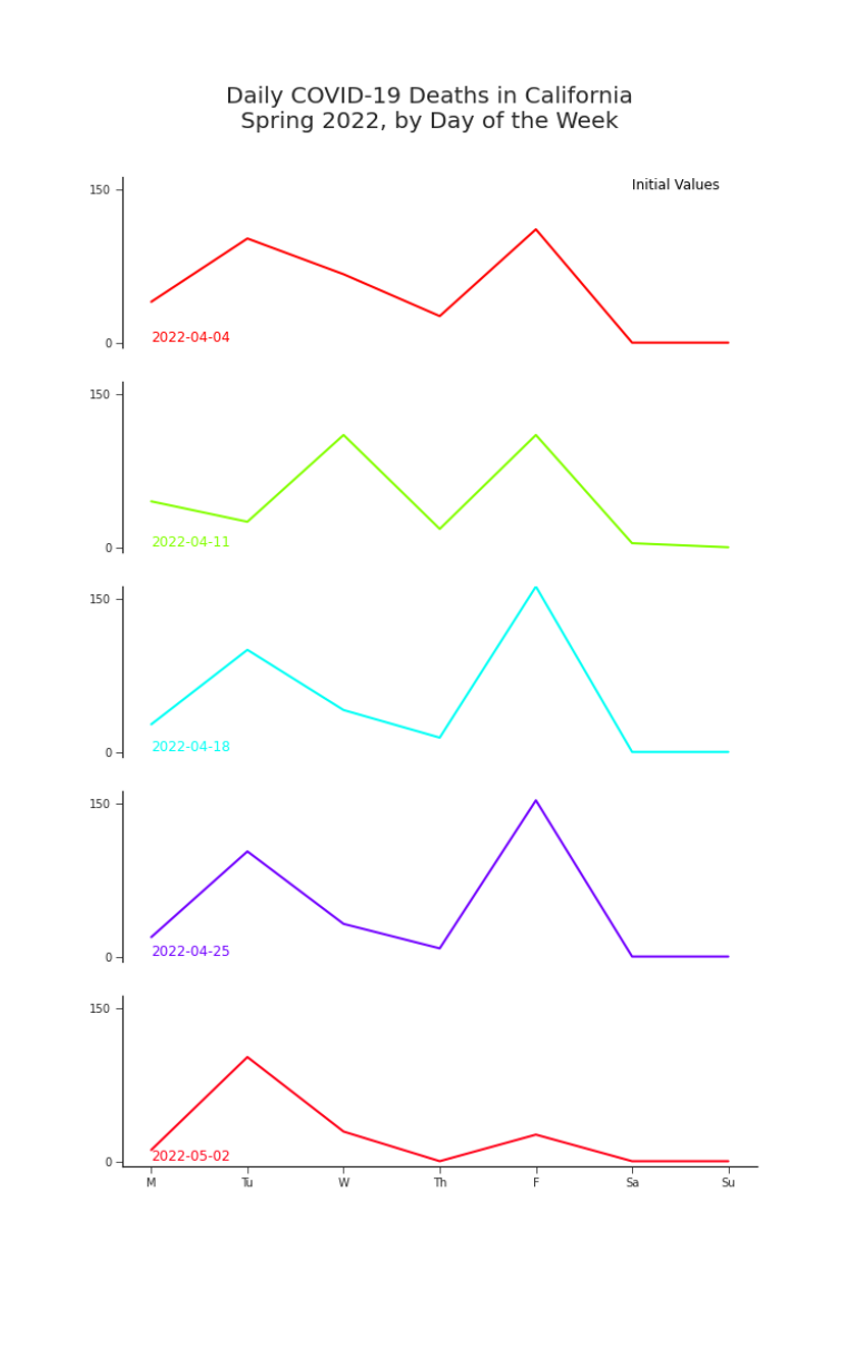
Figure 5. Deaths by Day of the Week in California, May 2022, Initial Values Tuesdays and Fridays are particularly dangerous days to have COVID-19 in California.
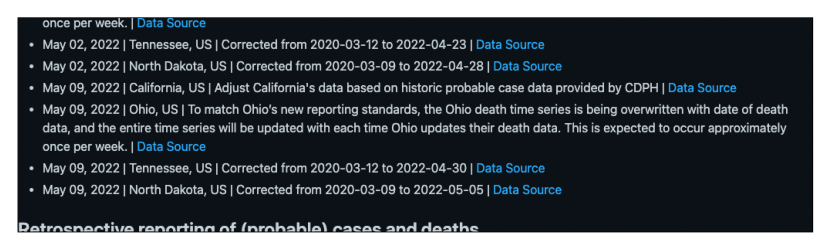
Figure 6. Detail of README.md from JHU CSSE COVID-19 Data 800 or so days into the pandemic, you’re incredibly thankful for the team’s diligent documentation–and desperate for a better solution. Looking for answers, you scroll through the now extensive README.md (6). You find what you’ve been looking for: “May 09, 2022 — California, US — Adjust California’s data based on historic probable case data provided by CDPH —.” It’s enough to tell you you’ll need more than just the current data set. You’ll need yesterday’s, too. Thankfully, by now you’ve built an archive of releases.
Flattened in Data Only
You plot the data released on May 8th against the data released on May 9th (Figure 7). There’s quite a difference. While just checking the total everyday,5 you’d have seen a flattening curve (Figure 1). In order to see the spike, you need to look at the whole history–which is newly rewritten. But, you do see your spike. It happened on Thursday, not Friday, but it’s there. With such a major shift in the data, you wonder about those oddities that plagued your analysis and wreaked havoc on your models. October 2021’s surge in deaths has disappeared. The only notable anomaly left is -8 deaths on the 30th (Figure 4). You look back to June of last year, when the dead seemed to rise and soon after deaths vanished entirely. Comparing new releases against old data, you find that more deaths were erased and new trends have appeared (Figure 1). You wonder what will become of this newest data oddity in a few weeks or months. Will it disappear too? By the end of the month you check back in, as seen in Figure 9. It still bothers you that the Friday spike occurs on a Thursday. It bothers you more that the spike isn’t still a bit higher. You can’t help thinking that there were some deaths lost in the shuffle of rewriting history. You wonder if those deaths are lost for good or if one day, weeks or months further down the road, we might see them back in the data.
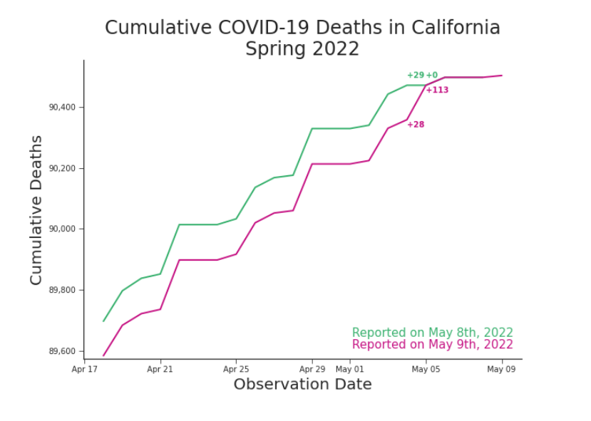
Figure 7. Cumulative Deaths in California, Spring 2022, Release for May 8th and 9th History is rewritten. The curve remains.
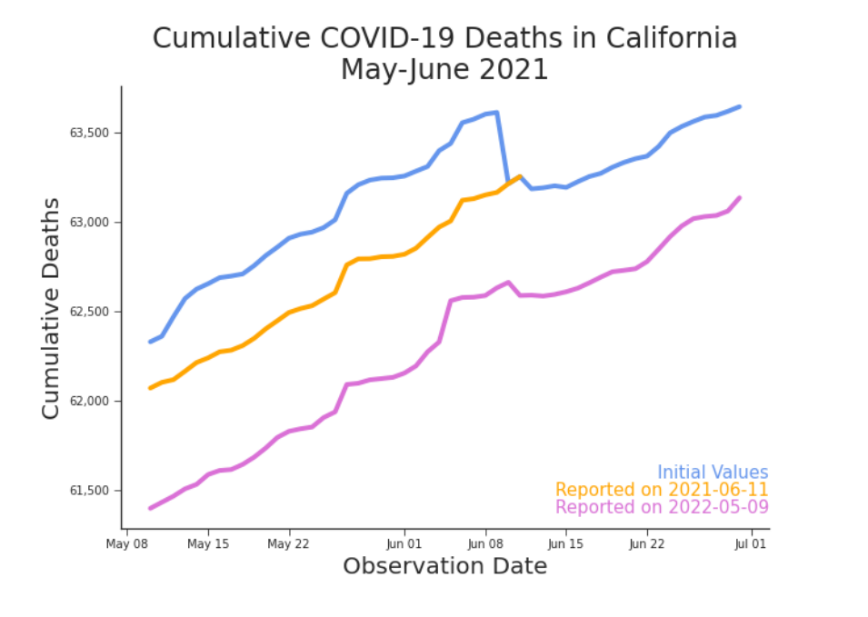
Figure 8. Cumulative Deaths in California, June 2021, Reported 3 Ways A new trend in old data.
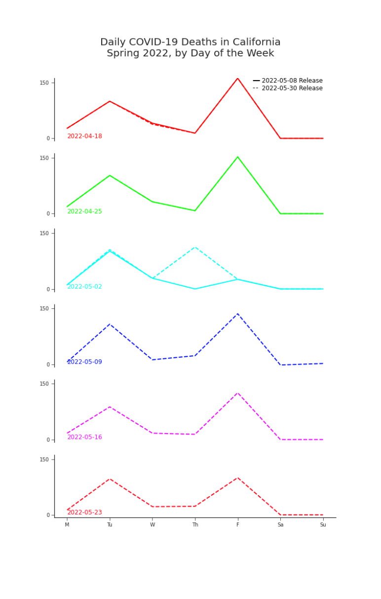
Figure 9. Deaths by Day of the Week in California, May 2022, as Reported in Two Releases The missing Friday surge in the week of May 2nd does eventually appear in a later release. But, the surge appears on Thursday. It’s more concerning that the surge is smaller than expected. Did some deaths get lost in the revisions?
Beyond a Nuisance
As of June of 2022,6 California’s previously reported death counts were restated on more than 17% of days. In that time, more than 3,000 previously reported values were adjusted. On eight different days, more than 20% of previously reported data was changed. The team at Johns Hopkins has done an incredible job documenting data changes over the course of the pandemic. JHU CSSE COVID-19 Data has four sections for data changes7 in its README.md file, in addition to an errata.csv file for its time series data files. As of November 8th, 2022, the errata file alone is over 8MB.8 The longer the pandemic lasted and the more states and counties that were tracked, the less feasible it was for data consumers to monitor errata and identify changes in data. Perhaps there were teams with the resources to do so. But for most citizen data scientists, researchers, and government bodies who were focused on responding the pandemic, it was simply not feasible. Many policy decisions have already been made, a massive amount of research has been published, and countless personal choices have been based on publicly available COVID-19 data, including the dataset we’ve discussed here. It’s only natural to wonder: if the data were then what the data is now, what would have been done differently? The answer to that is unknowable. But the quality of data is not. We do not need to build models disingenuously pretending that the data is perfect. We know it’s flawed. If we understand what those flaws are, we can understand what our data can–and can’t–do. Then we can act accordingly. These data challenges are not unique to COVID-19 or to public health. Nor are the risks and consequences of them. These challenges are endemic to modern data. COVID-19 data gives us a rare public case study with which to discuss, understand, and make progress towards understanding our data’s quality– instead of blindly assuming it and suffering the consequences of doing so.
Johns Hopkins COVID-19 death data is arguably the most trusted (near) real-time data for COVID-19 deaths in the United States. The Department of Health and Human Services (HHS), which houses the Centers for Disease Control and Prevention (CDC), defers to Johns Hopkins as their “preferred” source for death counts (Queen and Manocchio, 2022). Unfortunately, even the best data curators are limited by the quality of the underlying data being curated (Stoto et al., 2022).
Notes
-
Here we rely on the initial values reported by JHU. These are simply the first values reported by JHU for a given date. We’ll also discuss the first released values. These are the first values for a date that appear in a release after the observation date. For example, October 10th’s release might include a value for October 10th. That would be the initial value. The first release value would be the value that appears in October 11th’s release. In this subset of dates, the initial values and the first released values only differ on April 12th and only by 12 deaths. This dataset was curated from the datasets provided at the COVID-19 Data Repository by the Center for Systems Science and Engineering (CSSE) at Johns Hopkins University (JHU CSSE COVID-19 Data) (Dong E, Du H, Gardner L, 2023). For the code that collected this data, please see the Appendix.
-
More on that later.
-
It was actually more than 0.6% of all deaths reported at the time.
-
The way many people do for personal decisions and the way a system might be designed for speed and storage efficiency.
-
Between February 14th, 2020 and June 11th, 2022. Data modification records, Retrospective reporting of (probable) cases and deaths, Largescale back distributions, and Irregular Update Schedules.